London, UK
Scotiabank,
Brand System
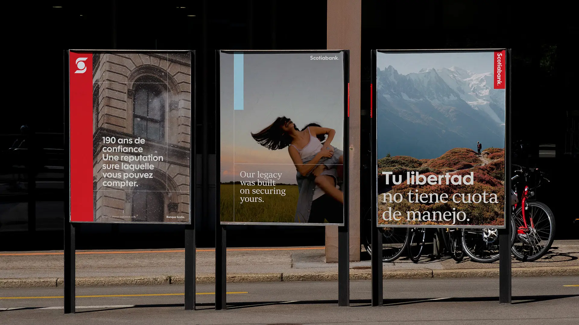
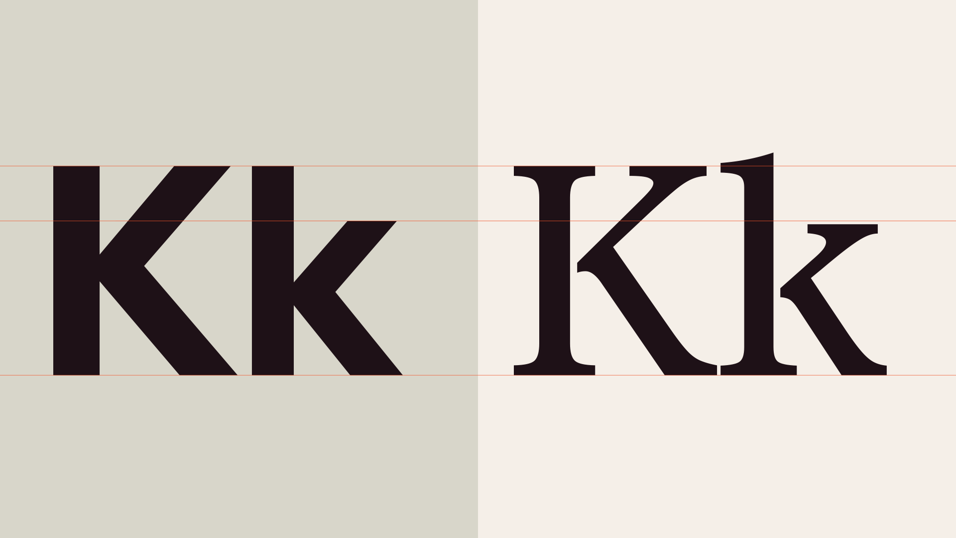
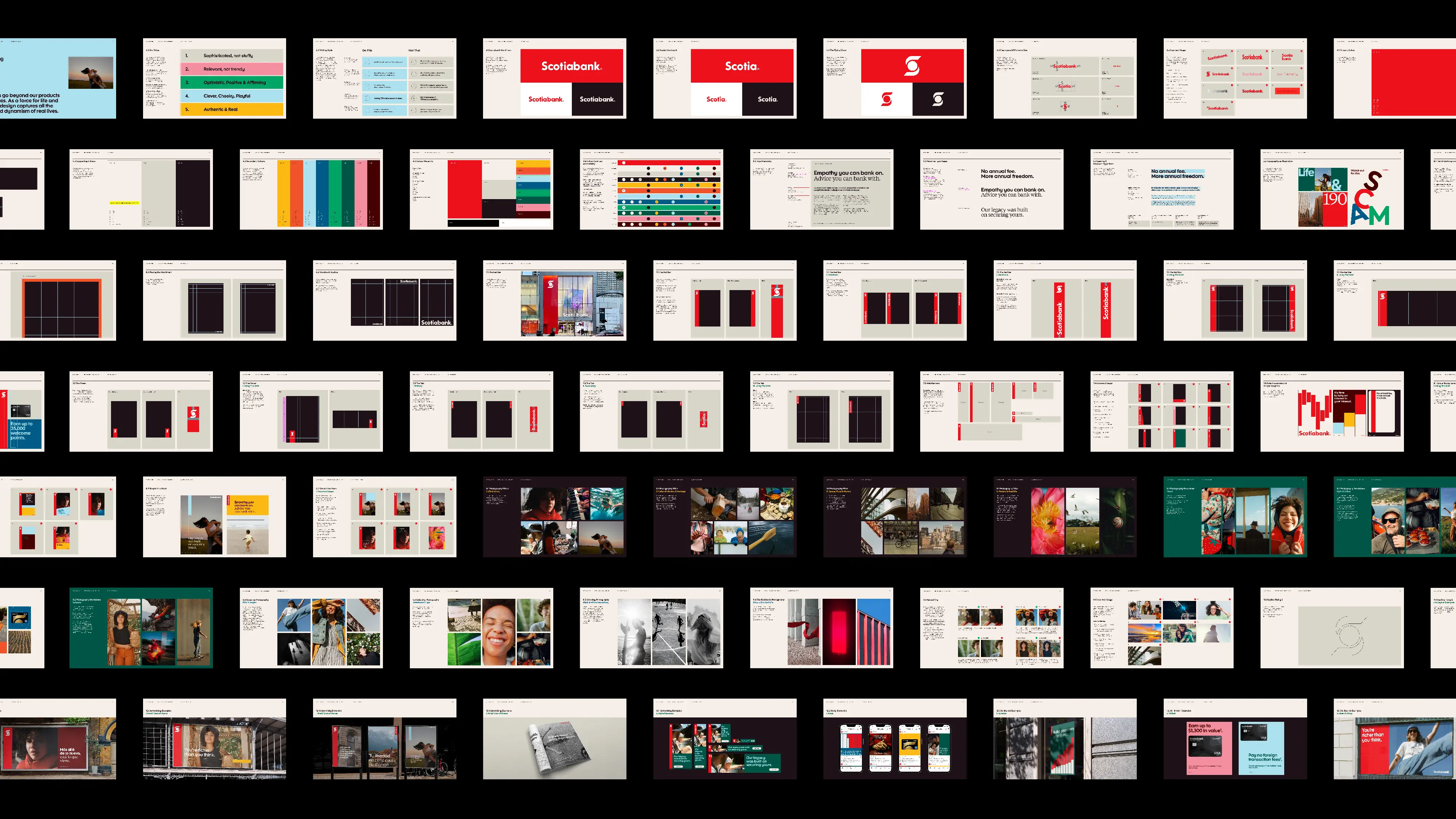
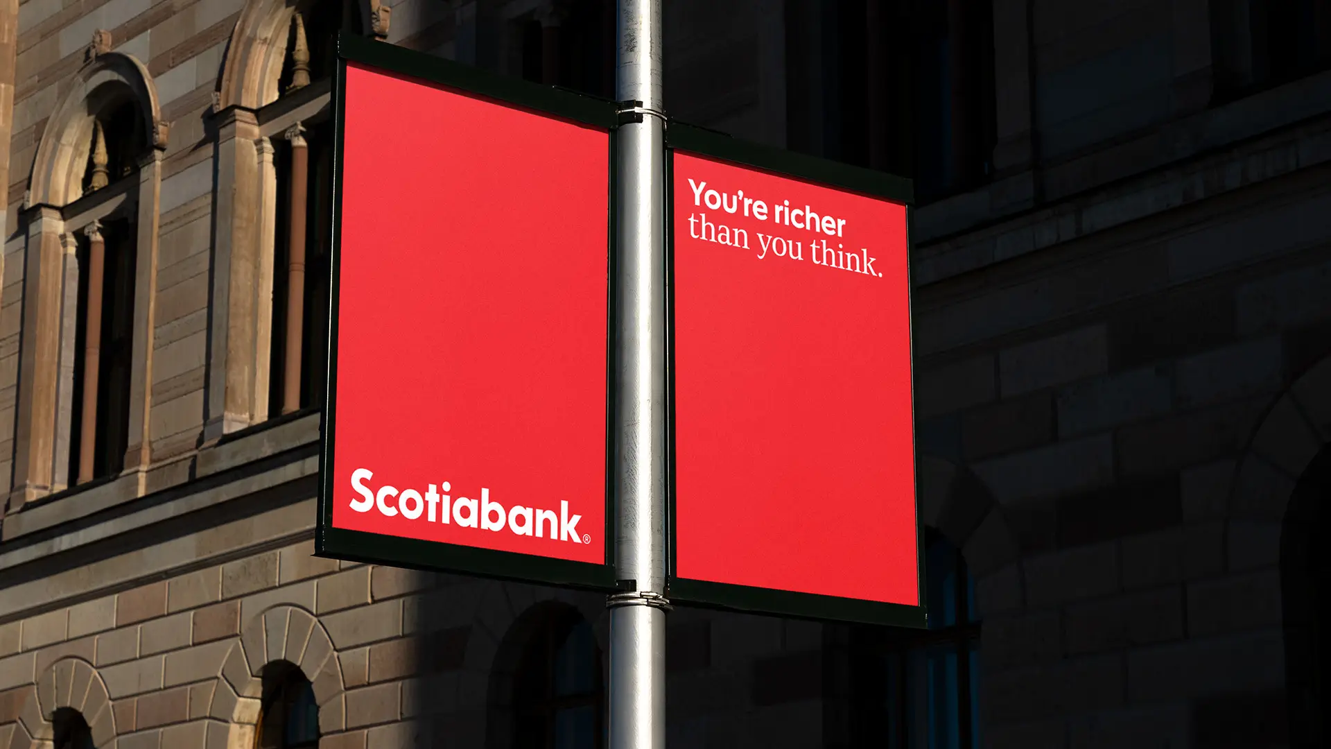
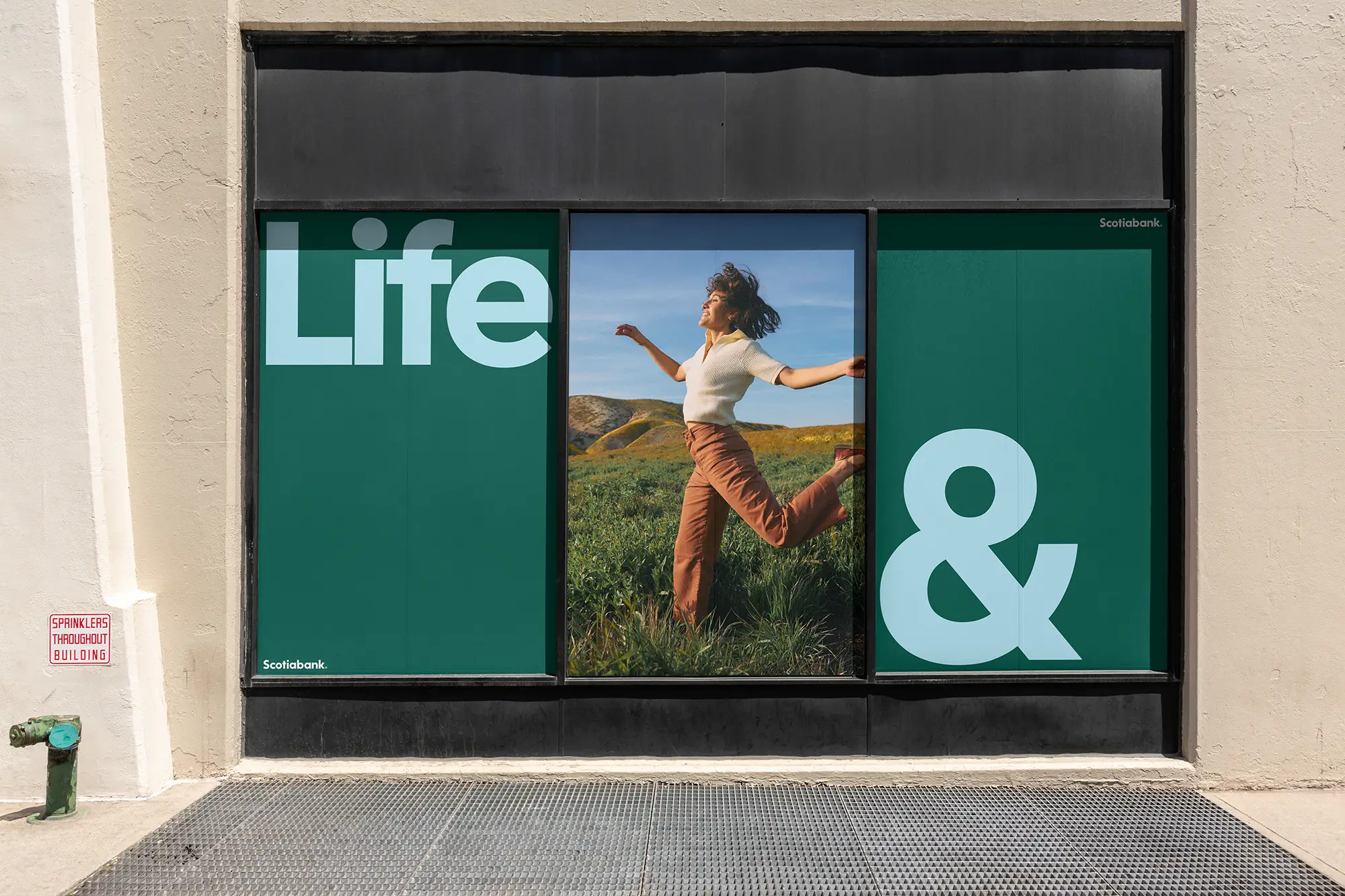
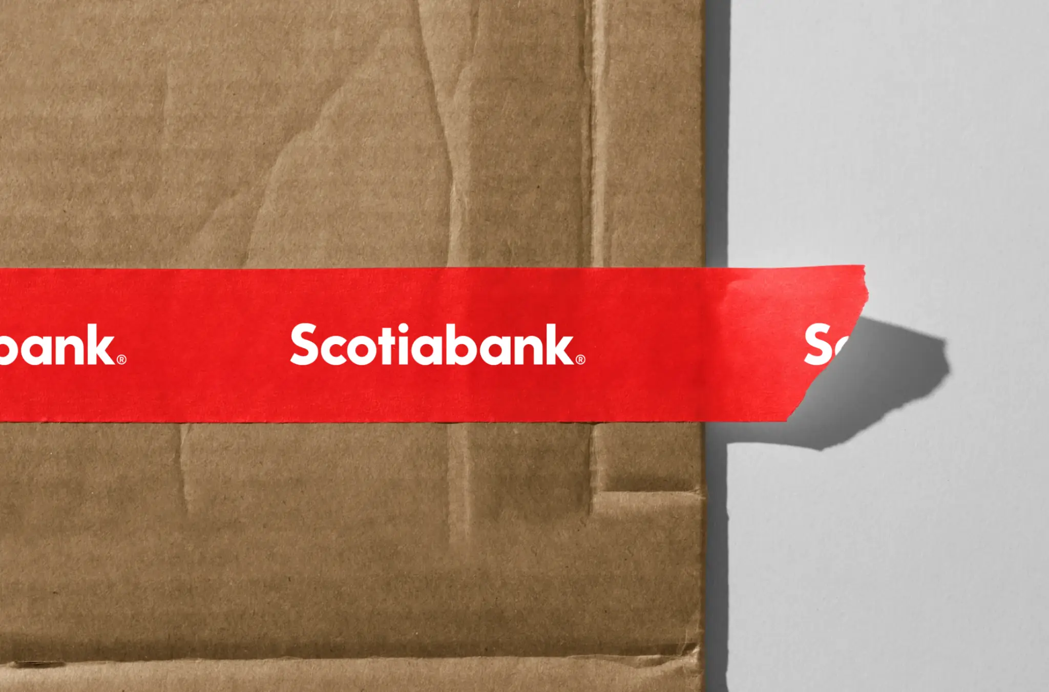
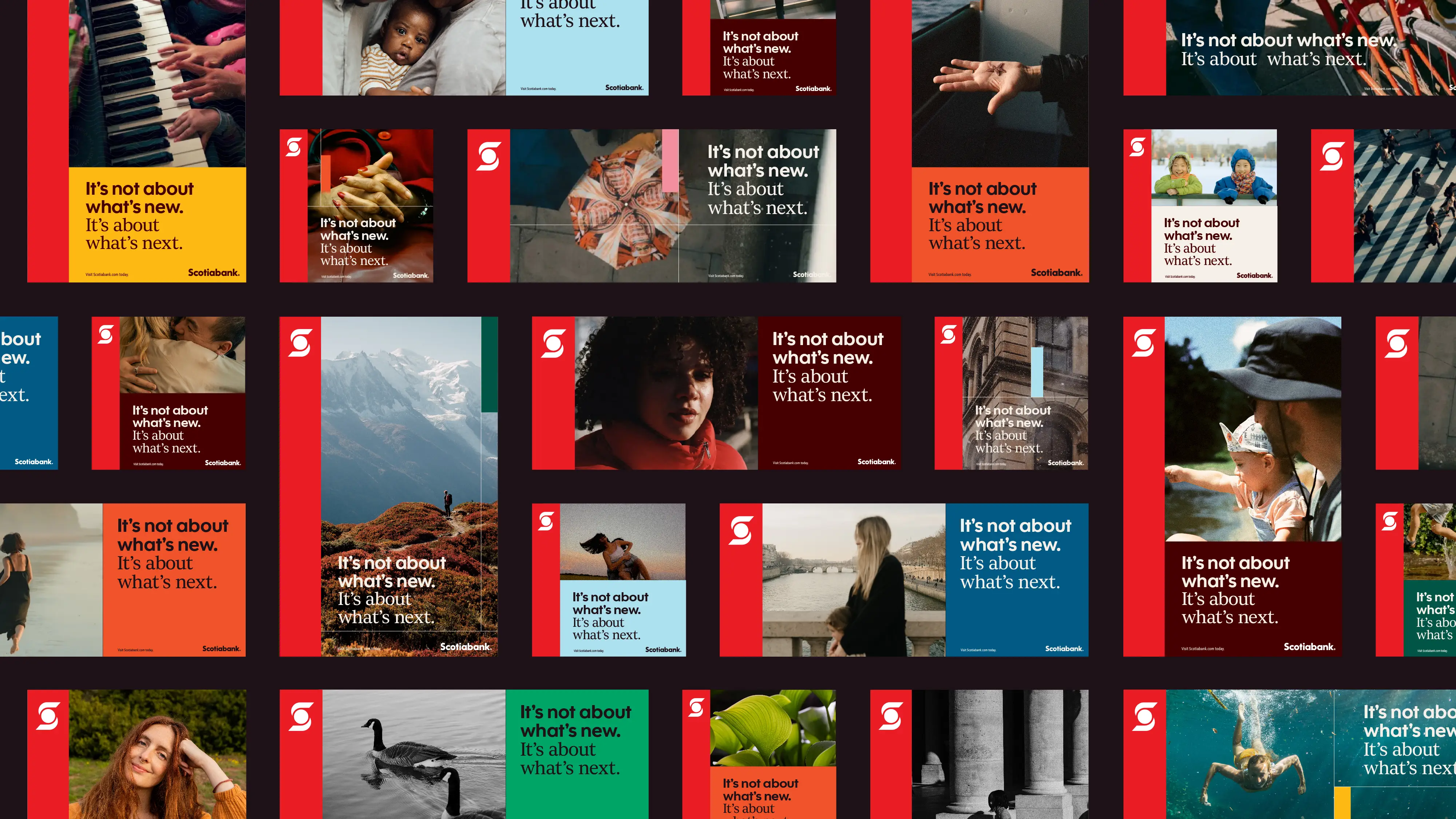
Scotiabank needed a rebrand that unified their global identity and appealed to a more affluent clientele. We started by establishing a consistent design system, drawing inspiration from their branch architecture, while thoughtfully referencing their heritage. To elevate their overall tone, we developed a sophisticated new approach to imagery, refined their colour palette, and worked with type foundry Dalton Maag to craft an elegant bespoke serif typeface. Proving that a consistent global rebrand can revitalize even a 193-year-old institution.
Studio:
Rethink