London, UK
Kollektif,
Brand Identity
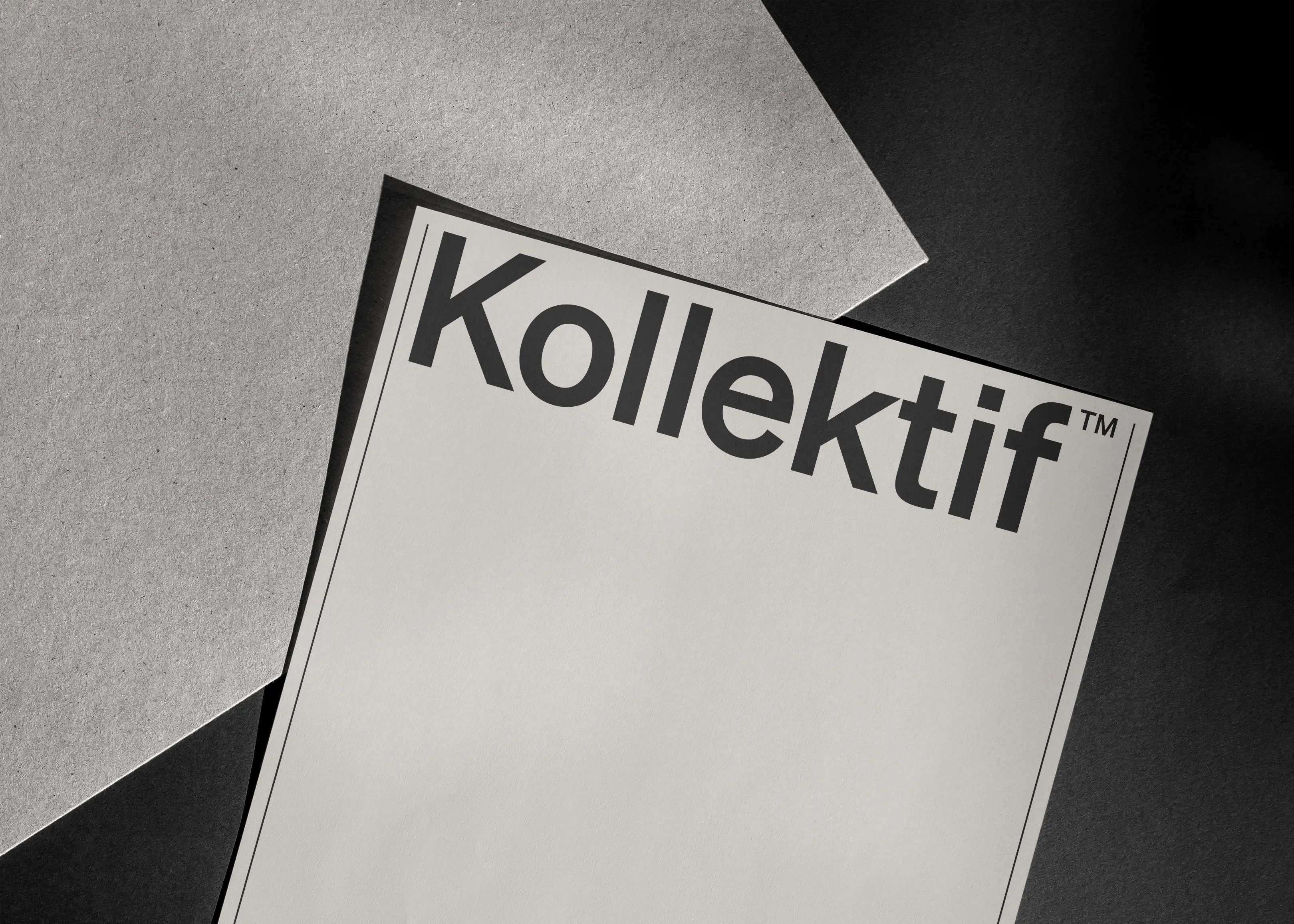
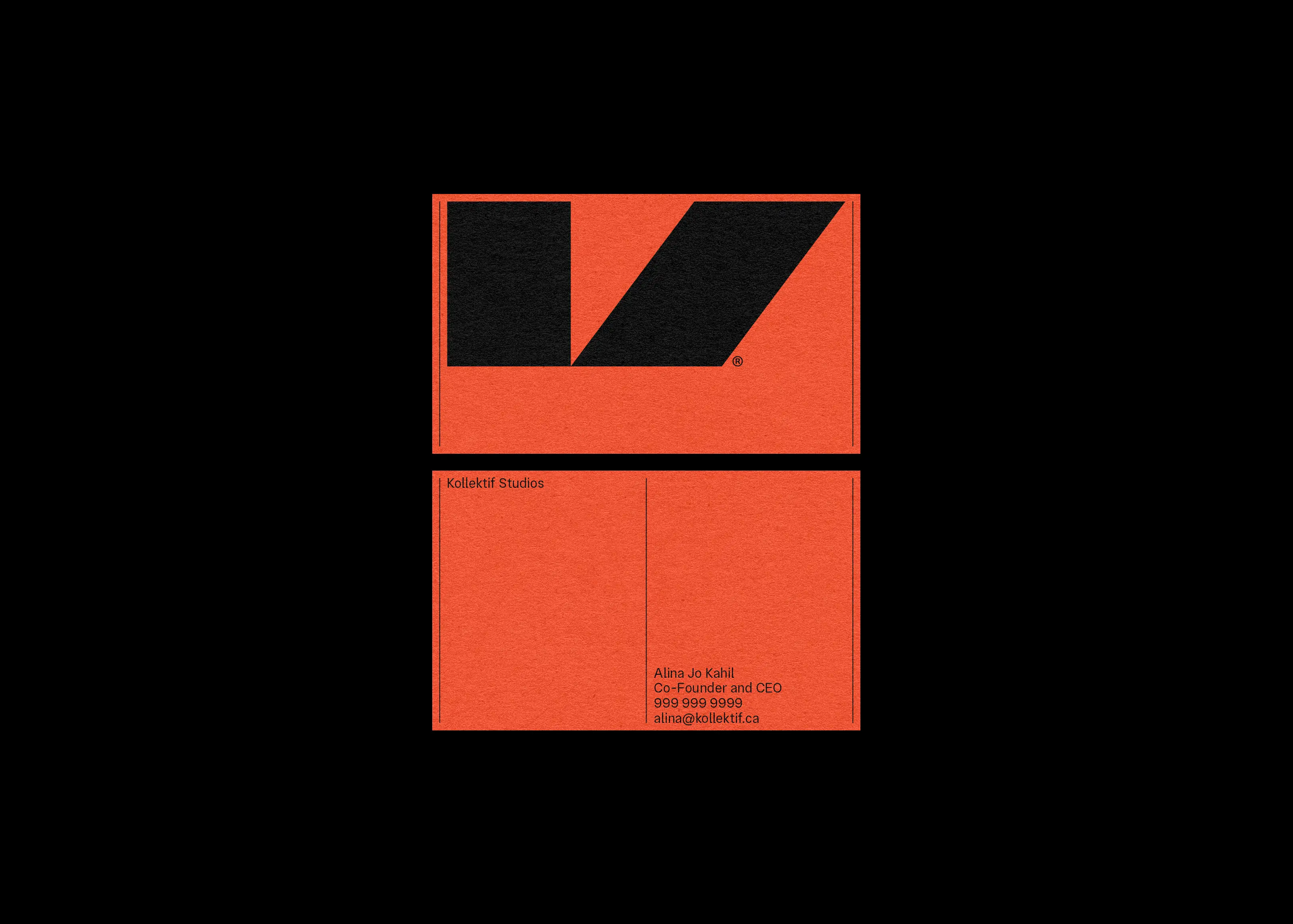
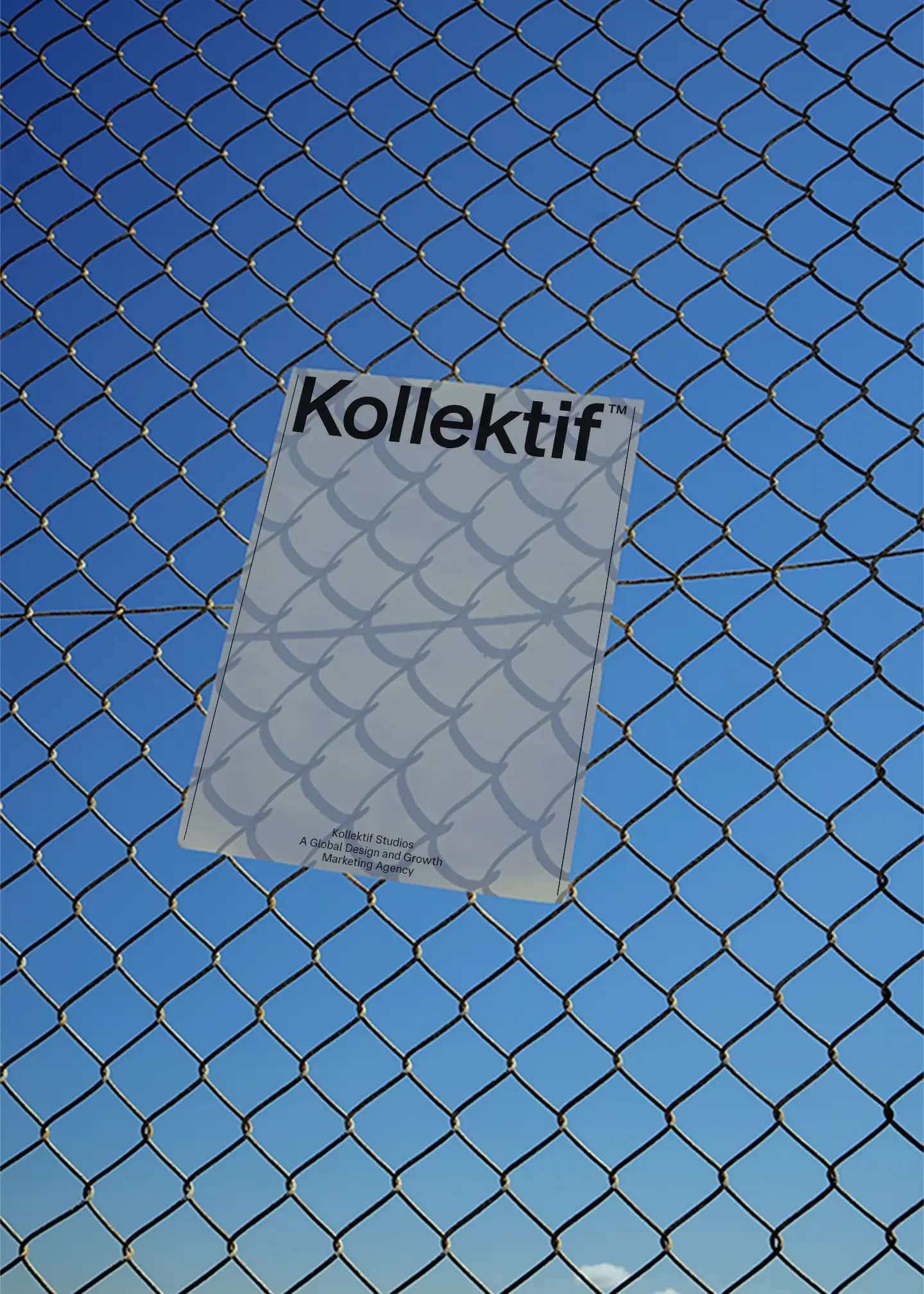
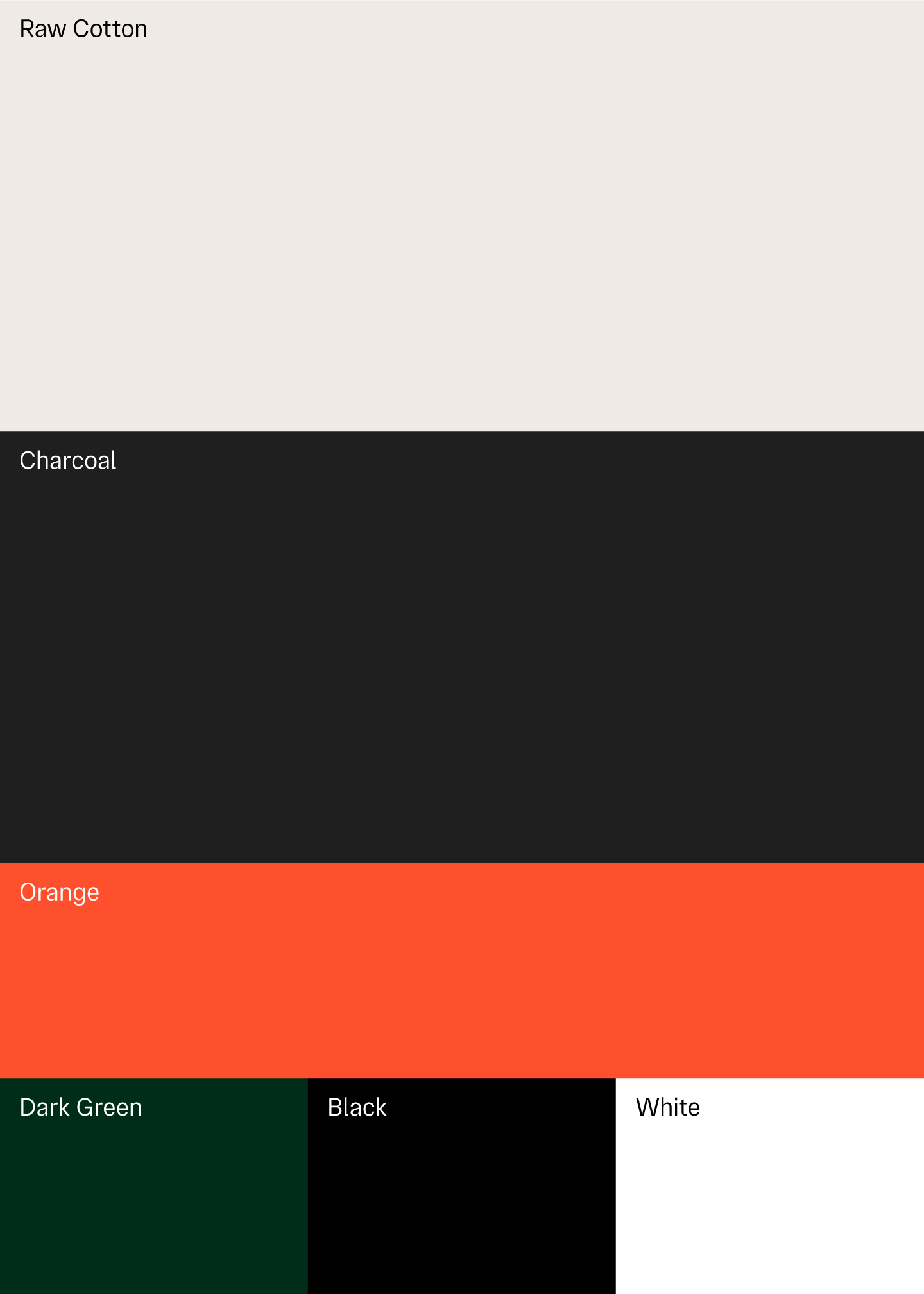
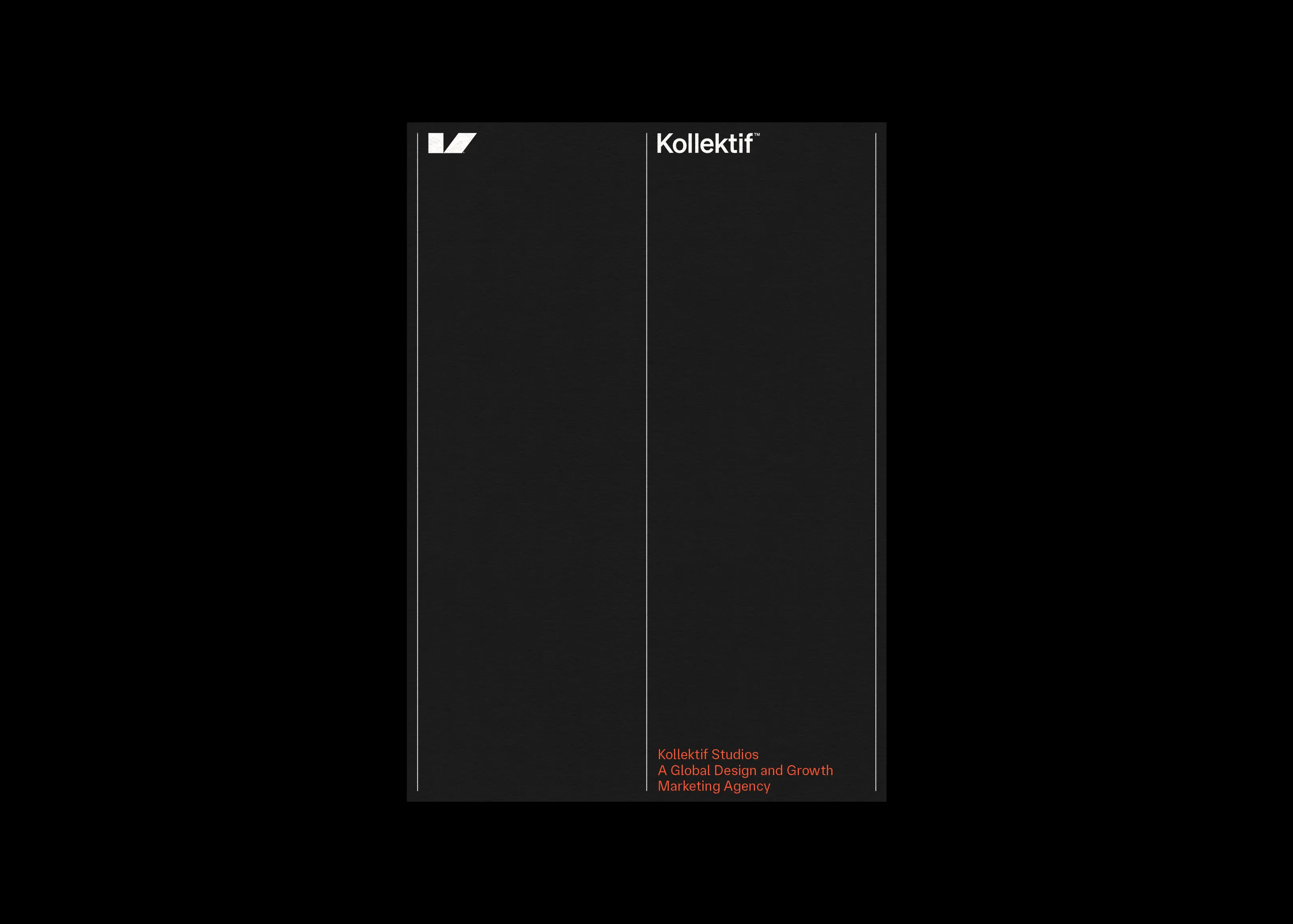
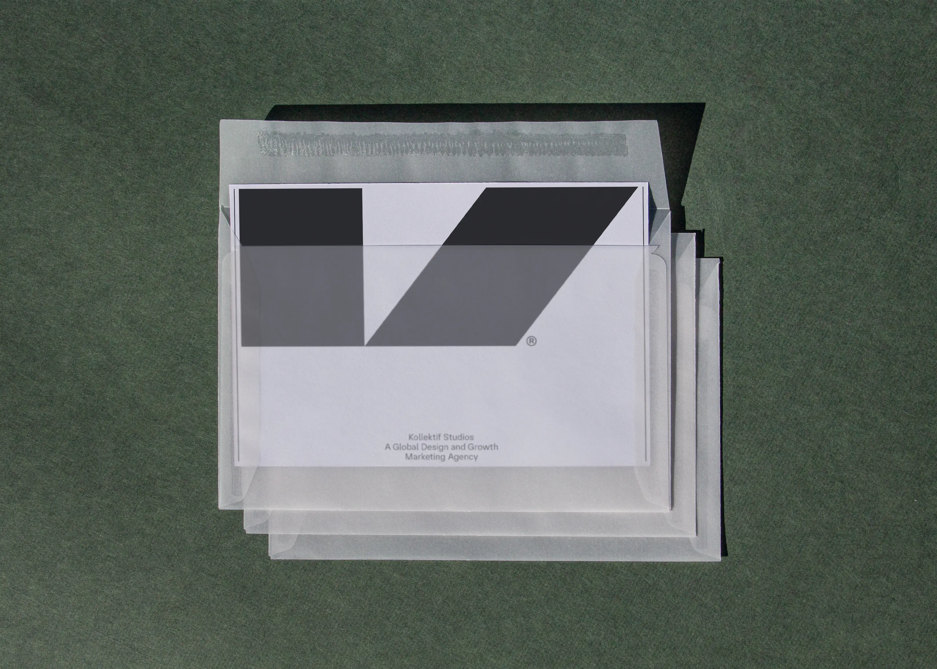
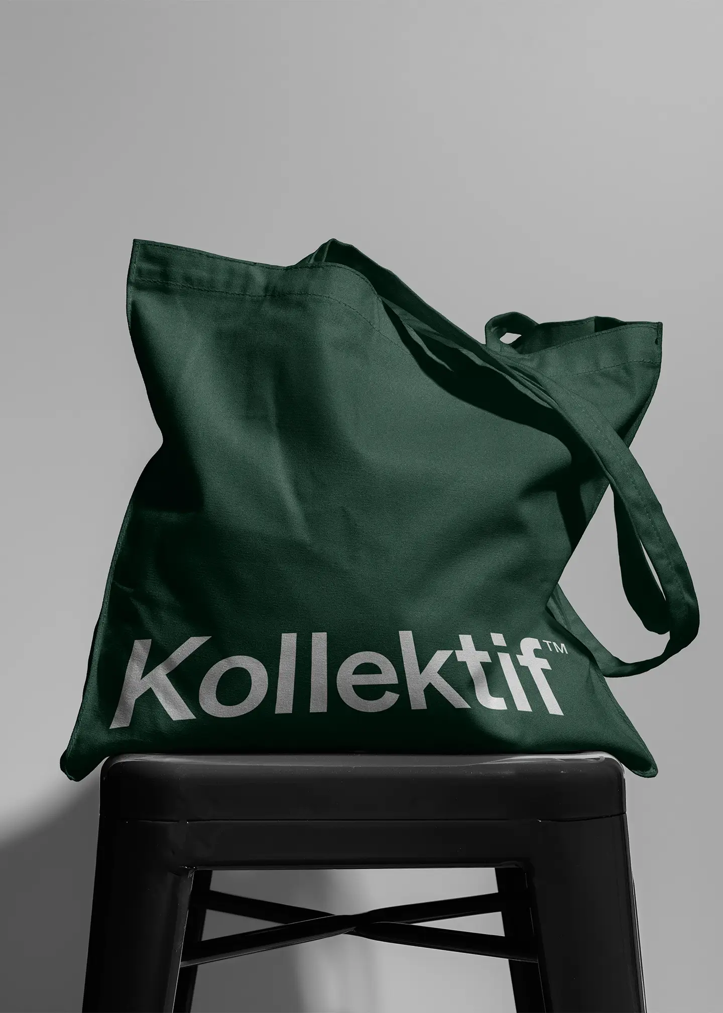
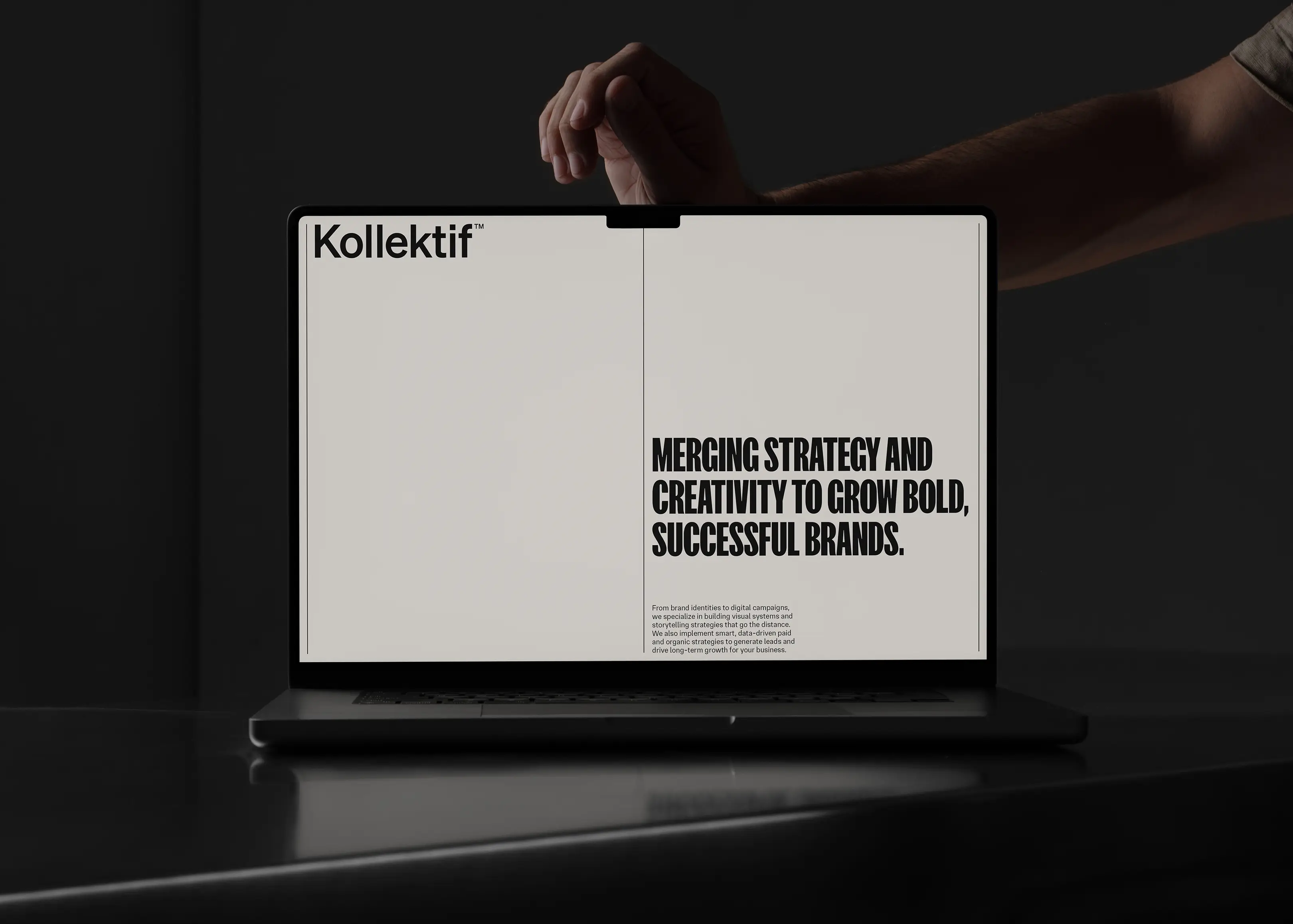
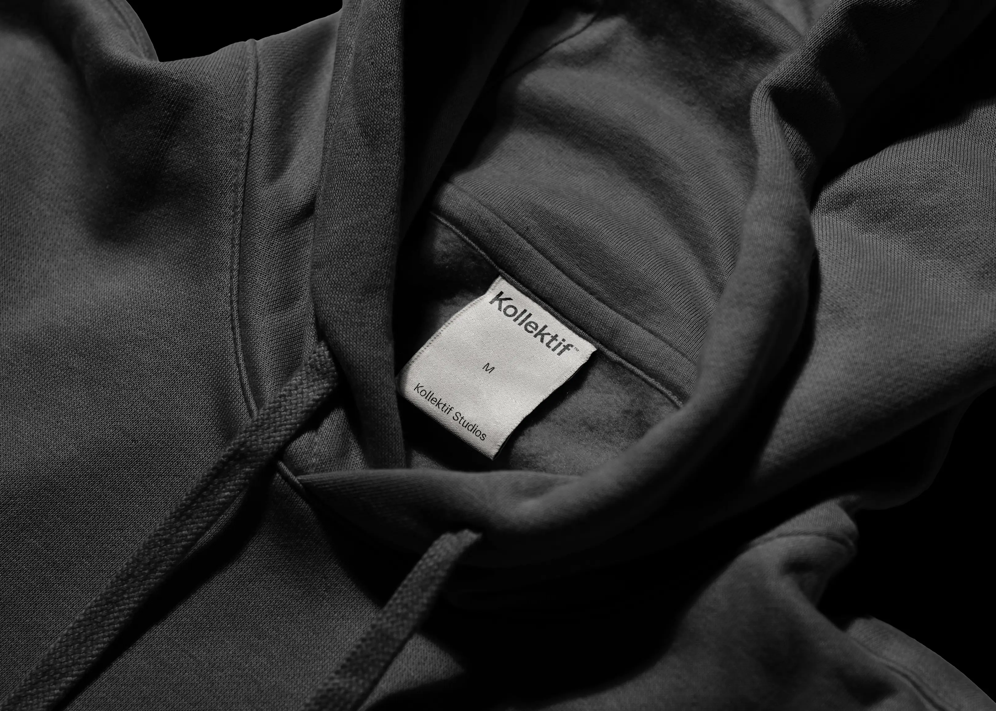
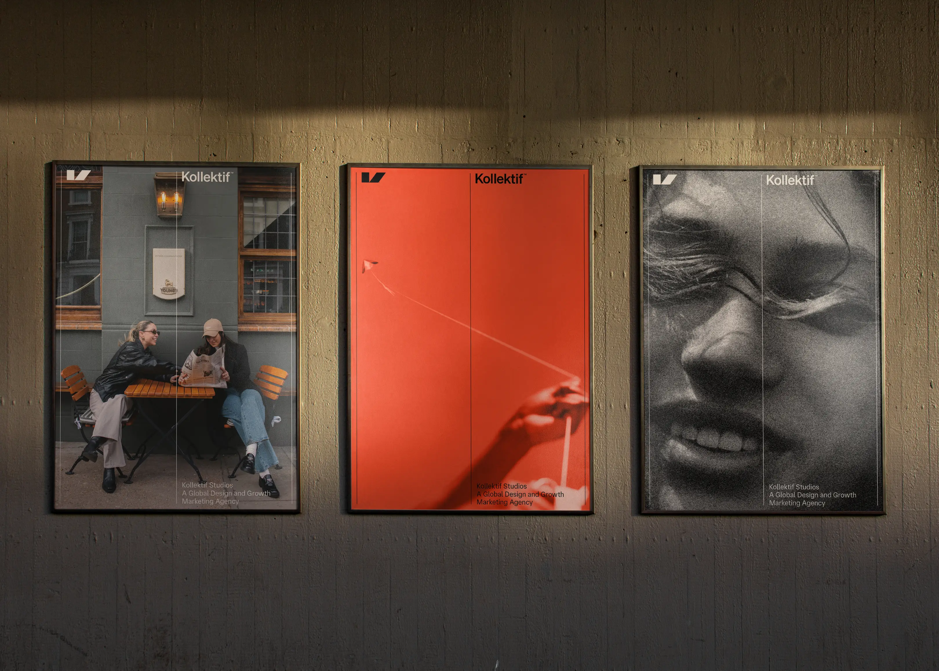
Kollektif Studios began with roots in clothing and merch, but as the business evolved, the founders set their sights on building a creative agency. We developed a bold, forward-thinking brand identity centered around a striking icon built from the top half of the letter K — strong, directional, and full of motion. To balance that energy, we paired it with a timeless sans serif typeface and a visual system inspired by the stitching found on clothing labels. The colour palette leans on warm tones of black and white, with a bright orange accent to bring contrast and character. Combined with art-directed, playful photography that feels candid and human, the result is a brand that looks ahead while staying true to its roots in apparel and creativity.
