London, UK
KD,
Brand System
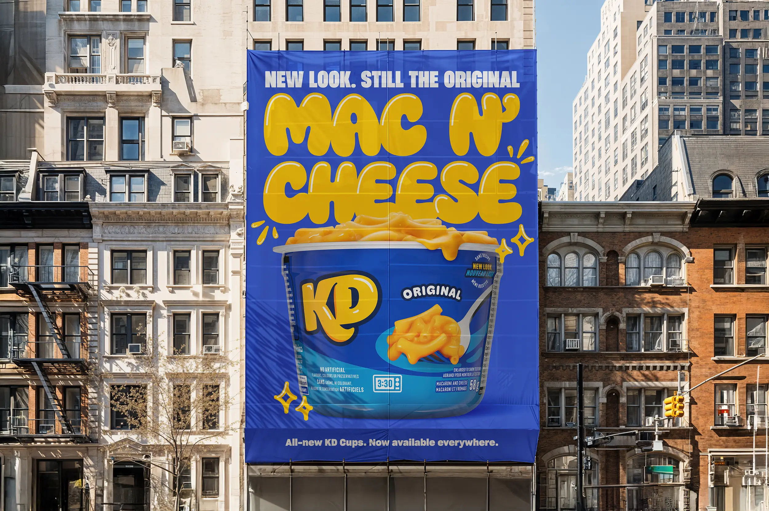
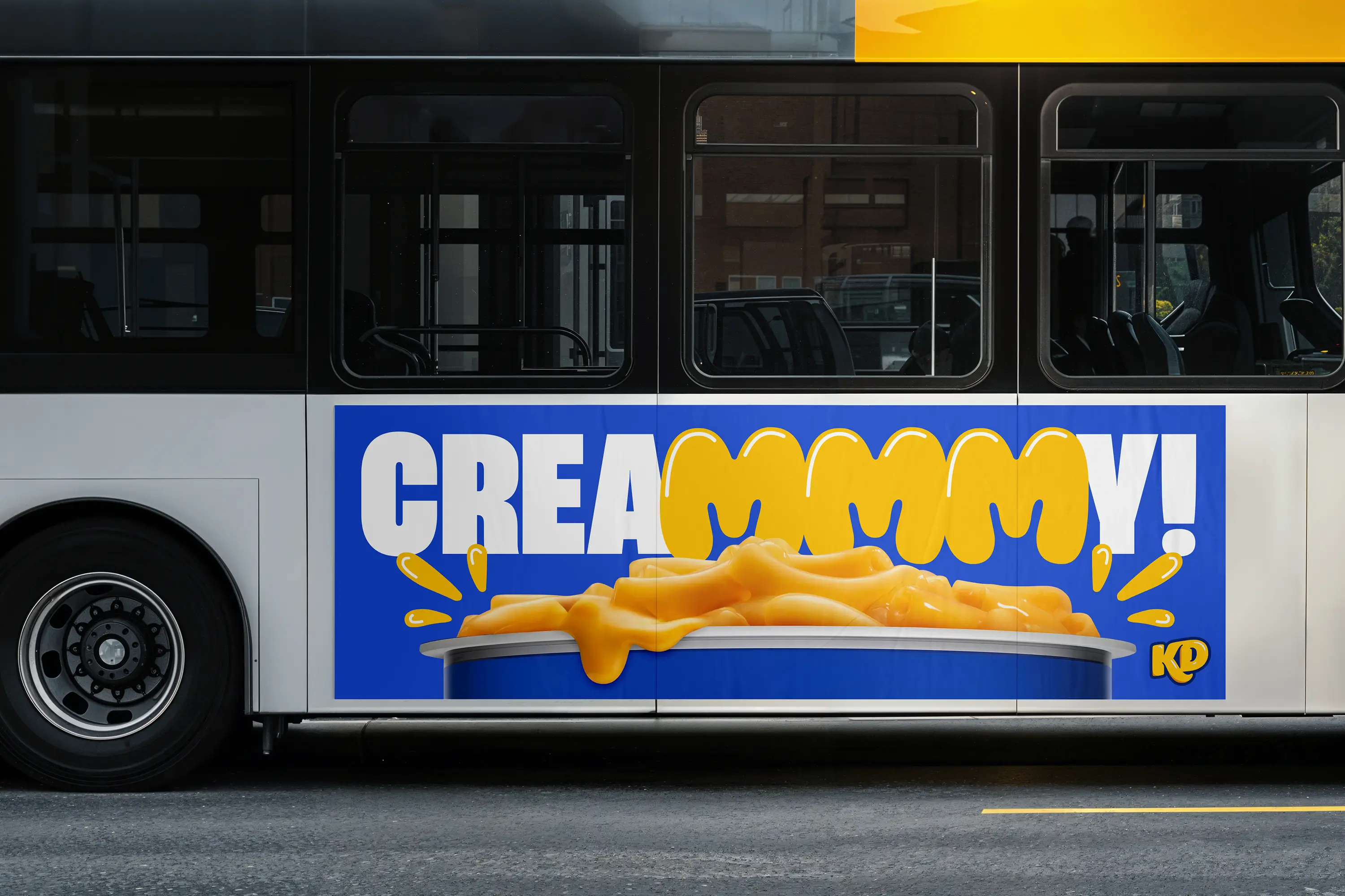
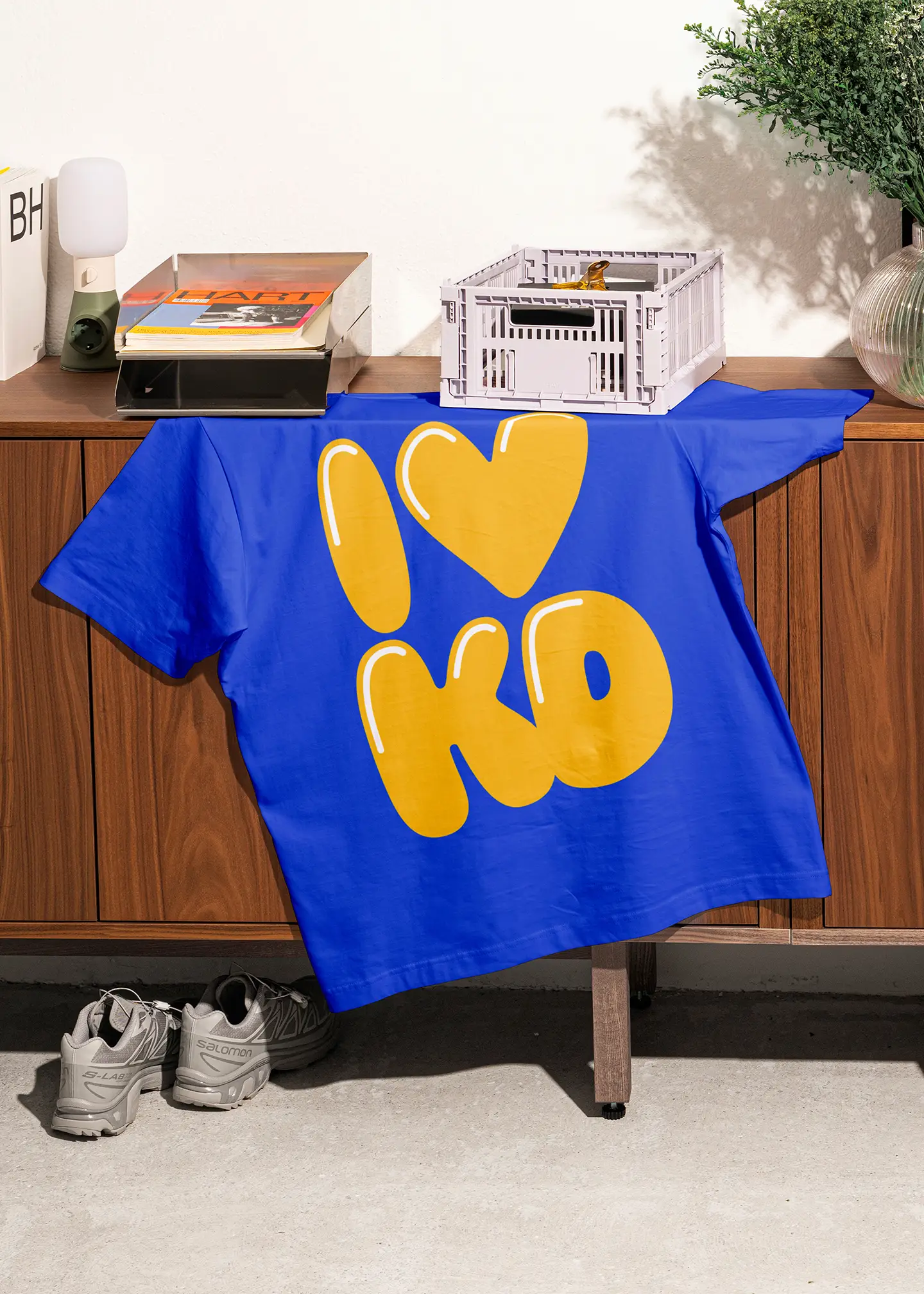
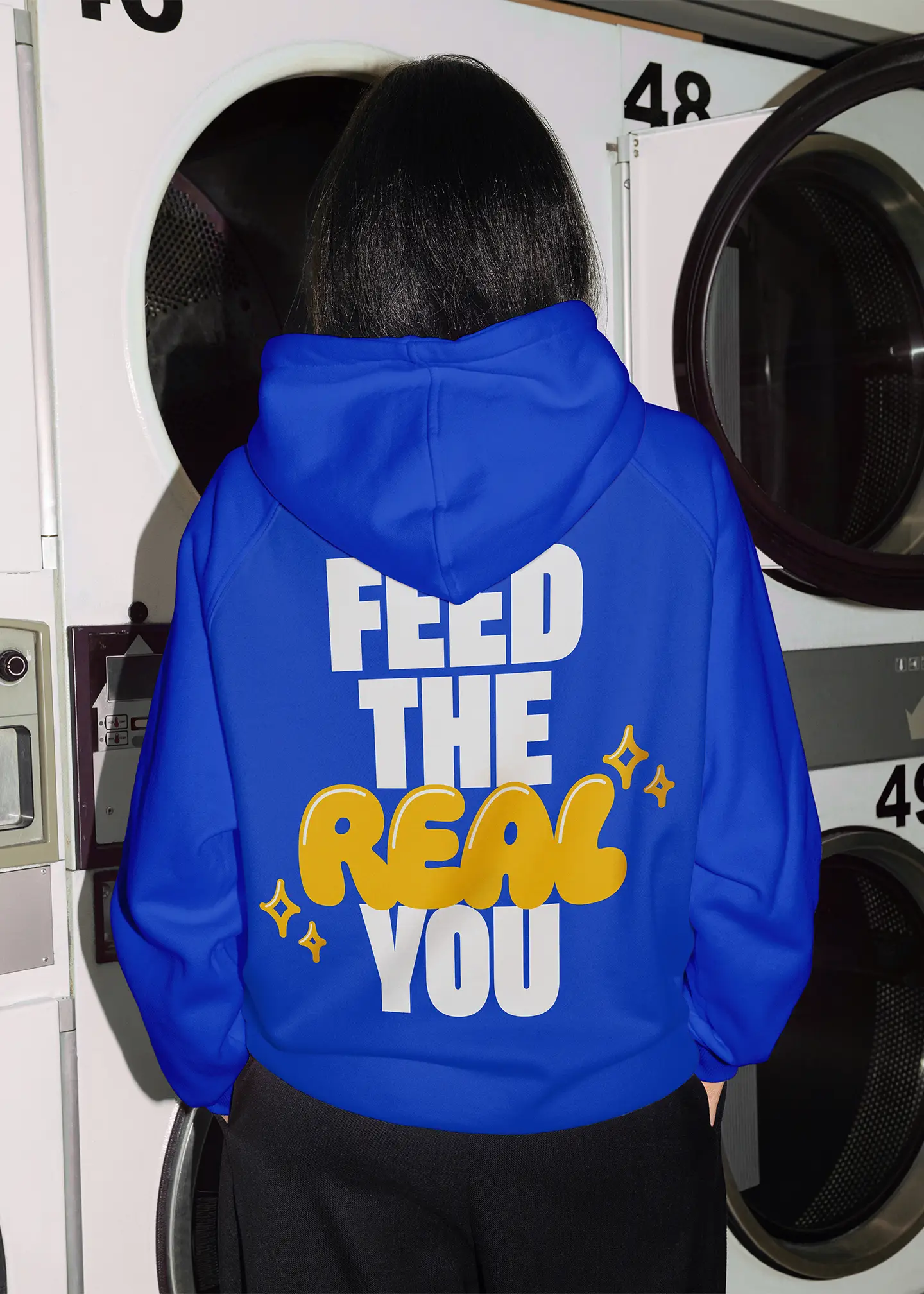
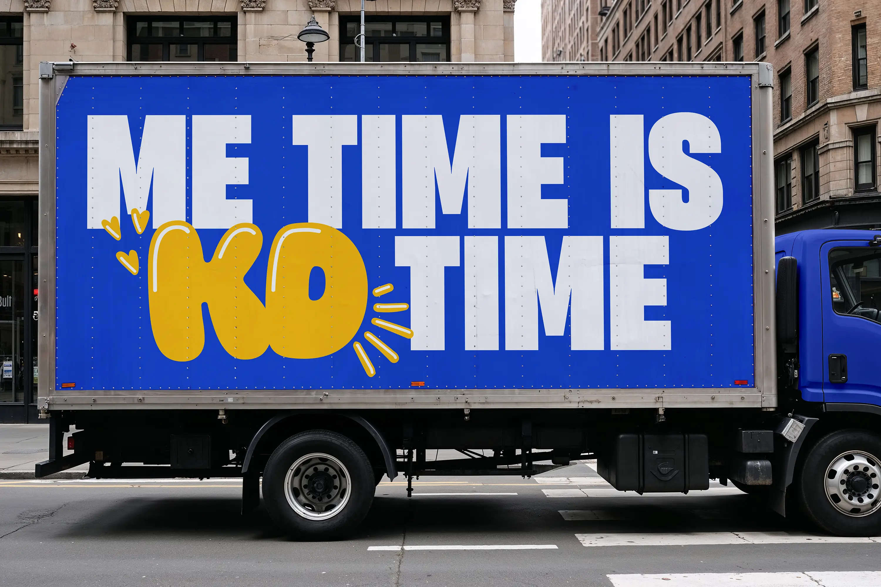
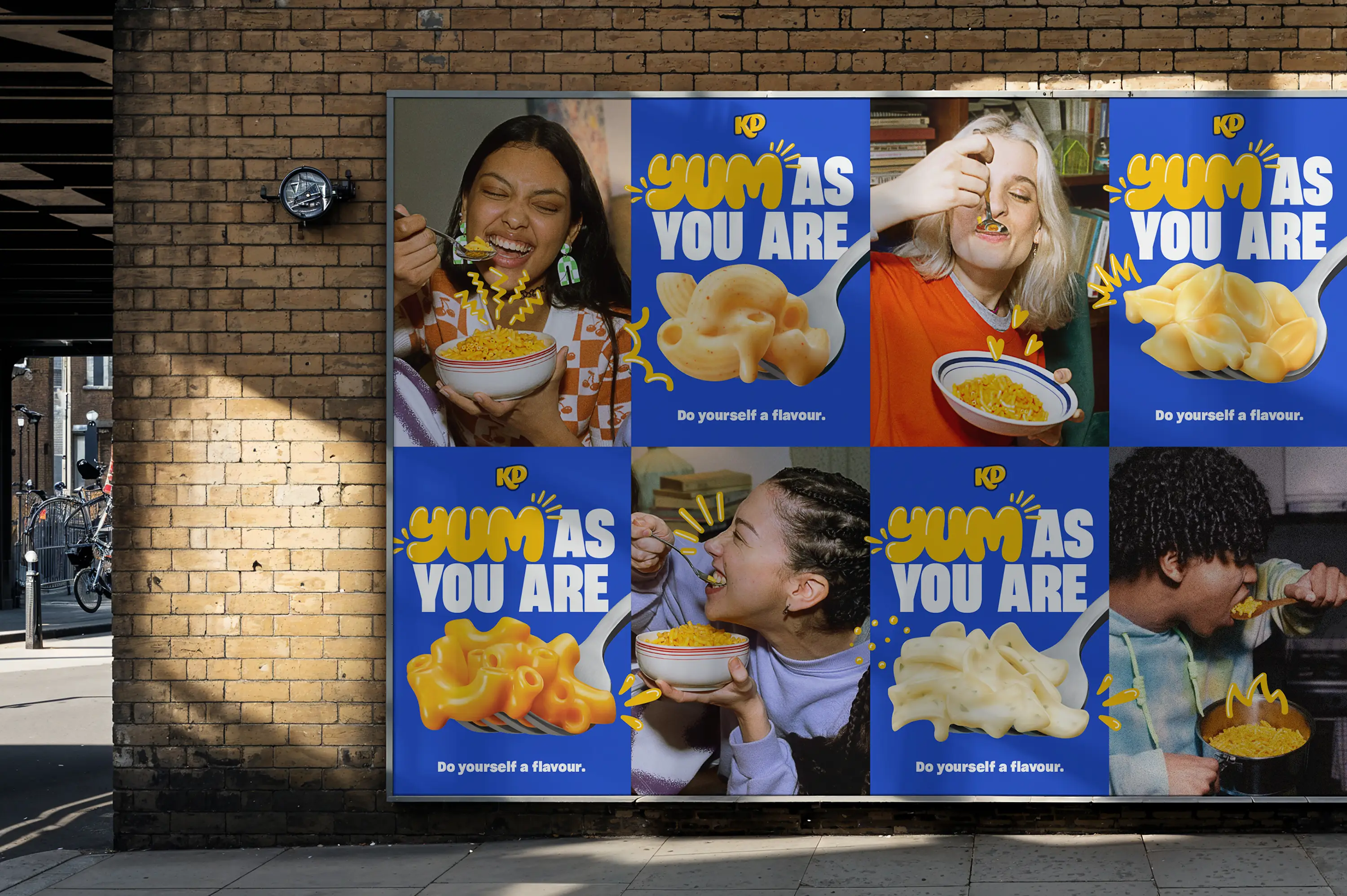
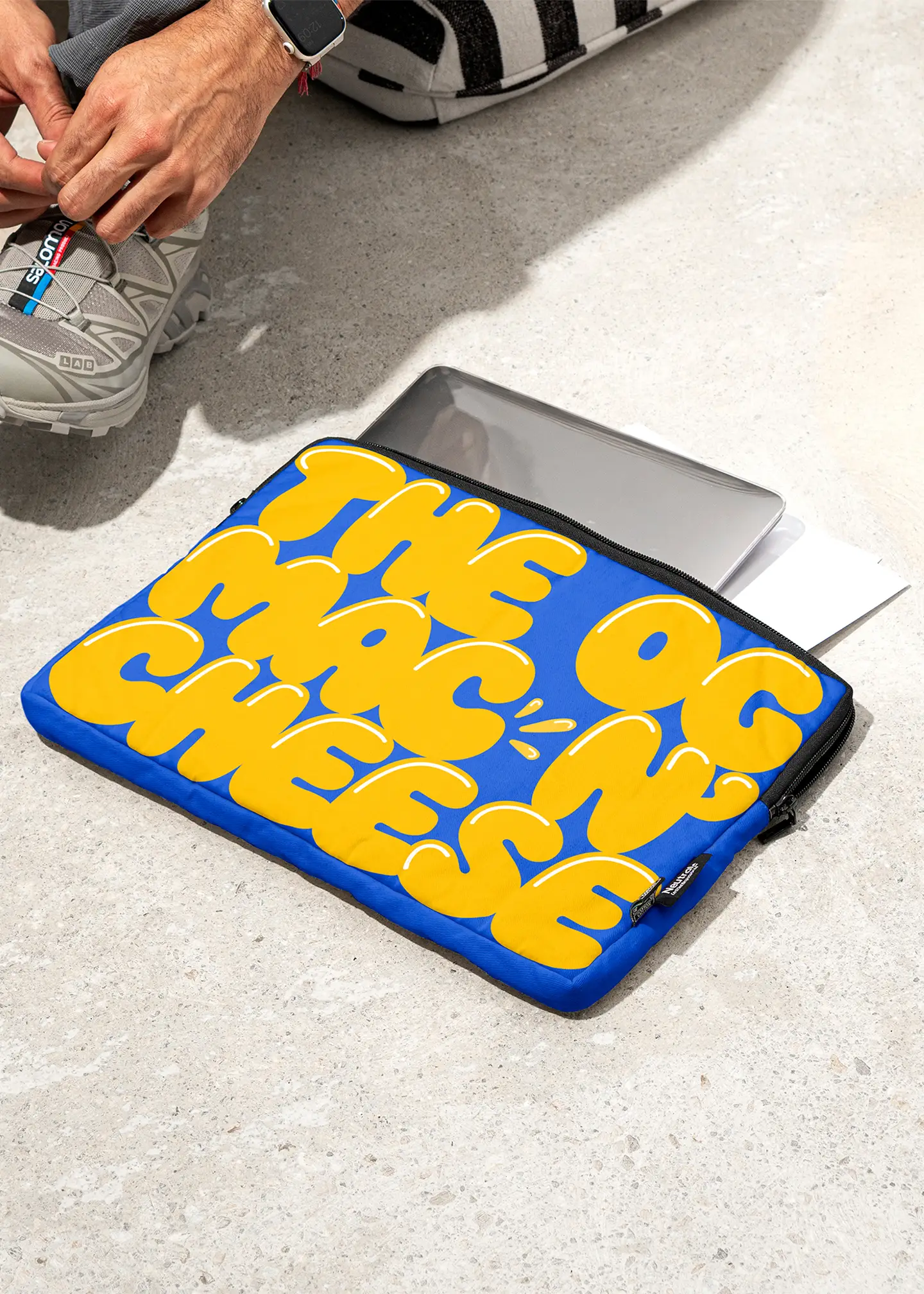
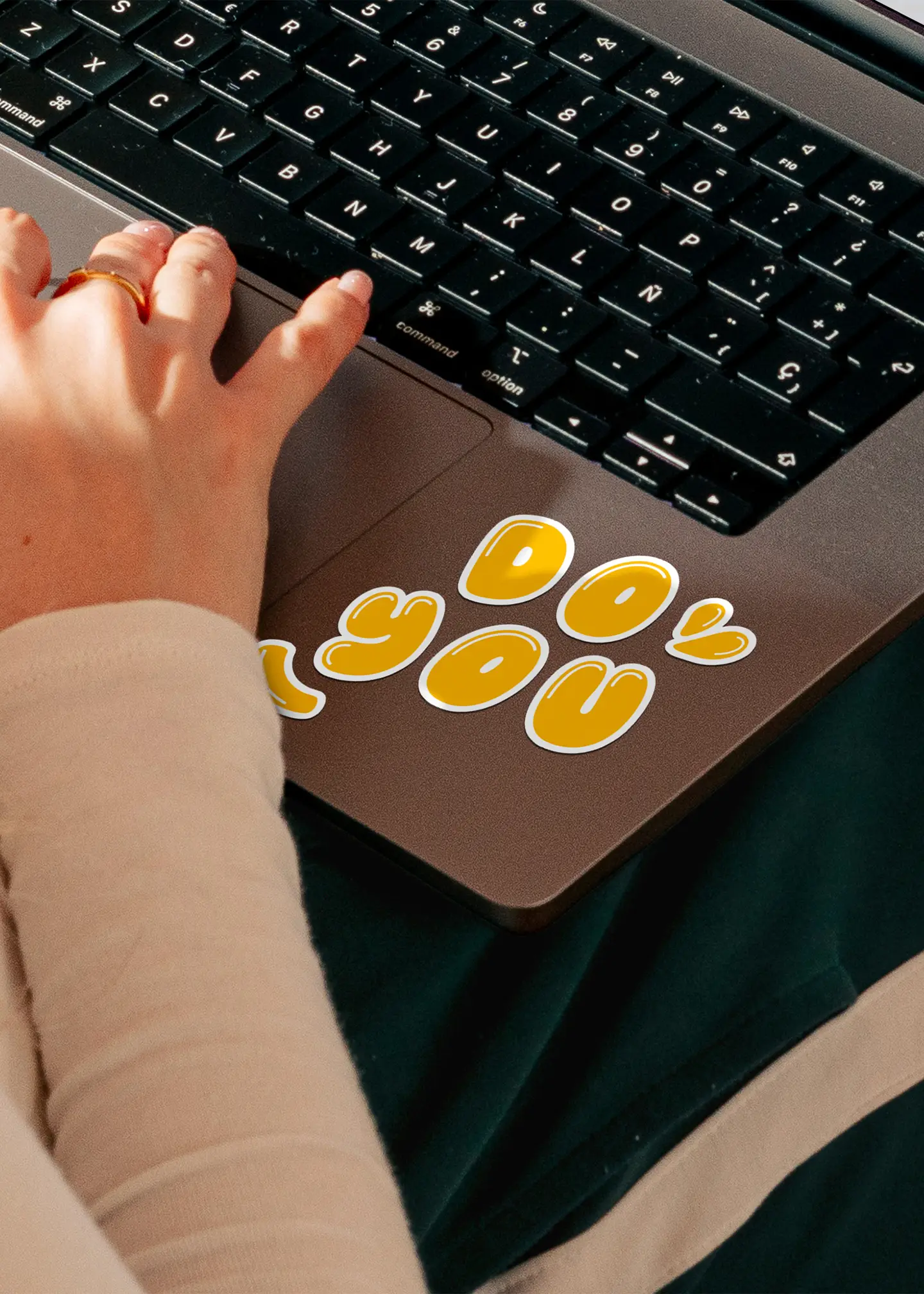
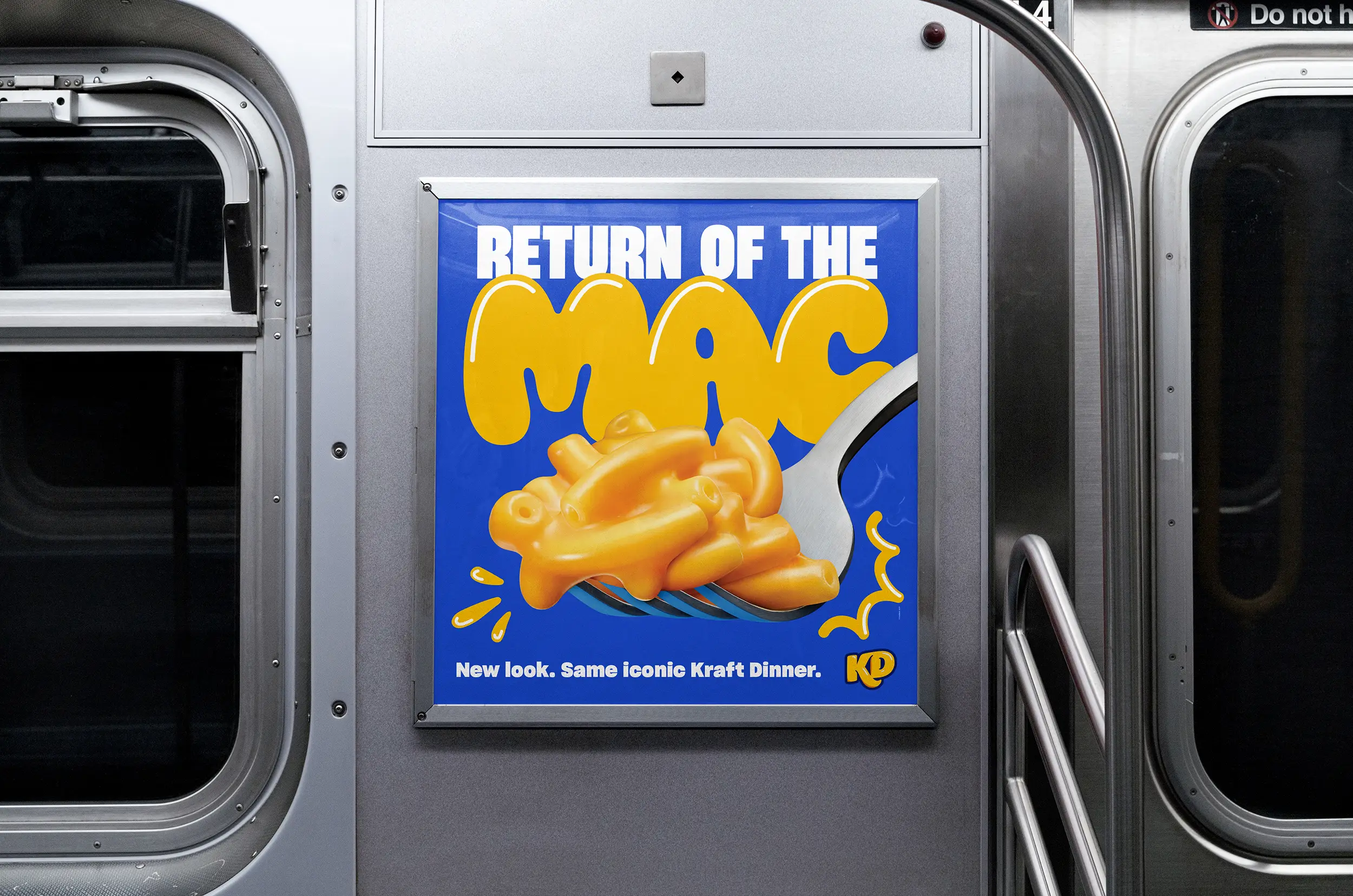
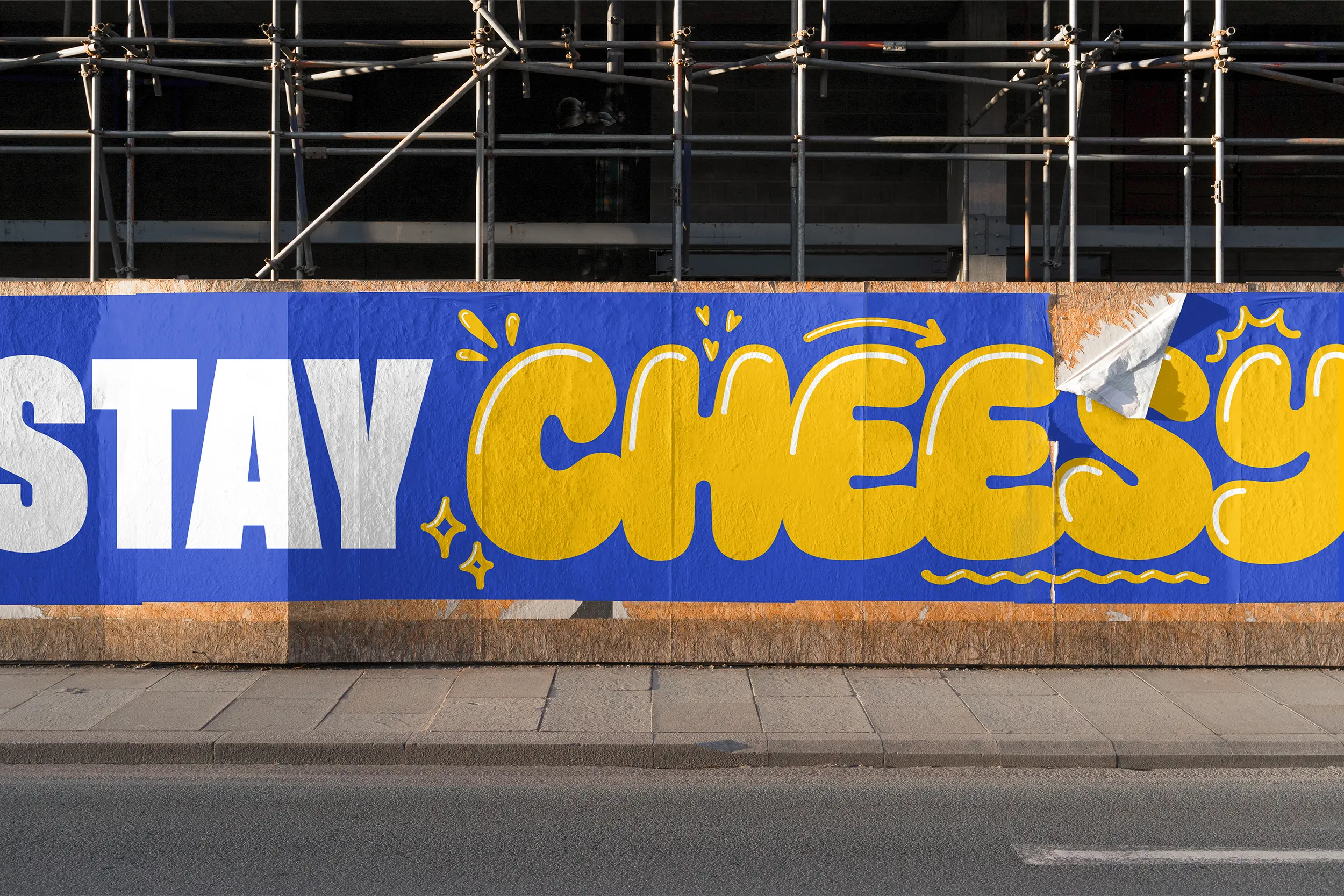
KD isn’t just another boxed mac and cheese brand. They're the original. For decades, KD wasn’t competing in the category, they were the category. But over time, they lost their edge. To reclaim their spot and grab the attention of younger generations, we doubled down on what makes KD, KD. We expanded on our instantly recognizable blue and yellow box to give KD an entire brand refresh. We worked with OHNO Type Foundry, putting our cheesy flavour front and centre with a custom typeface that oozed craveability. We then channeled hand-drawn street art with a full set of doodles to add a level of personalization to each design. And finally topped it off with an authentic photography style that captures how people really enjoy KD in their everyday lives.
Studio:
Rethink